MOHAP — statistics dashboard for healthcare insights
A statistics dashboard for healthcare teams to track indicators, analyze trends, and act on insights.

Project Overview
We supported the design and structure of an interactive statistics dashboard for healthcare analytics across the UAE.
The goal was to create a clear, modern, and efficient dashboard that helps teams track key healthcare indicators, analyze trends, and access meaningful insights faster. Readability, data hierarchy, intuitive navigation, and visual balance were essential to make the dashboard suitable for regular government-level analytics.
Process
From concept to crafted detail.
A look at how the work came together — from early direction to the finished surfaces that ship.
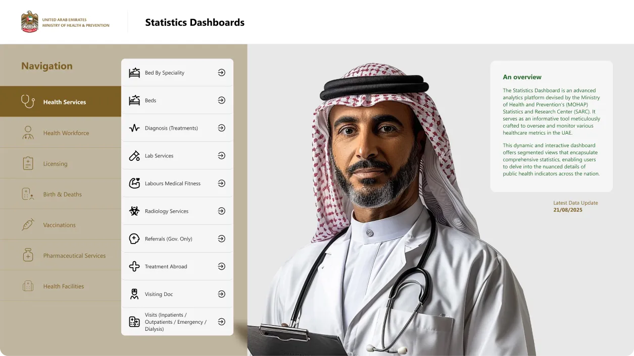
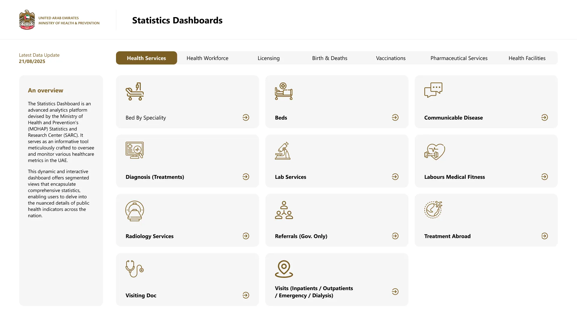
Navigation built for quick search and analysis
The dashboard groups healthcare data into clear service categories and uses a persistent navigation system to help users move quickly between sections. This structure makes it easier to search, compare, and analyze indicators without losing context.
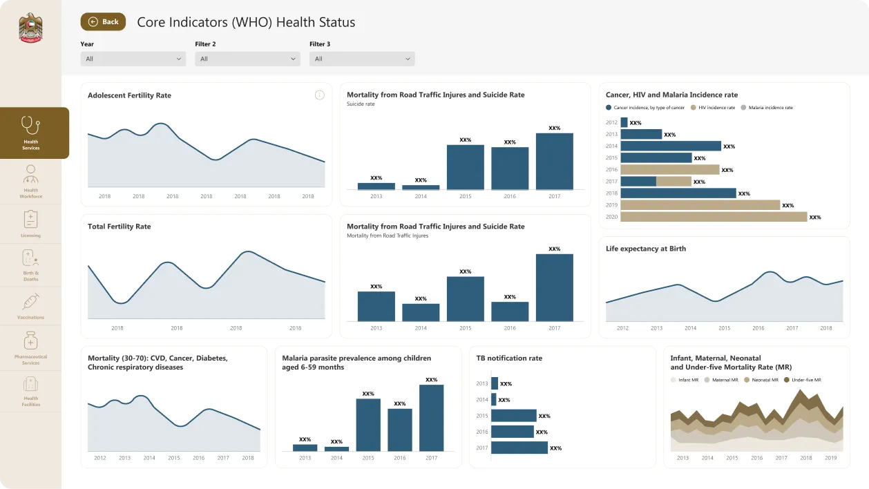
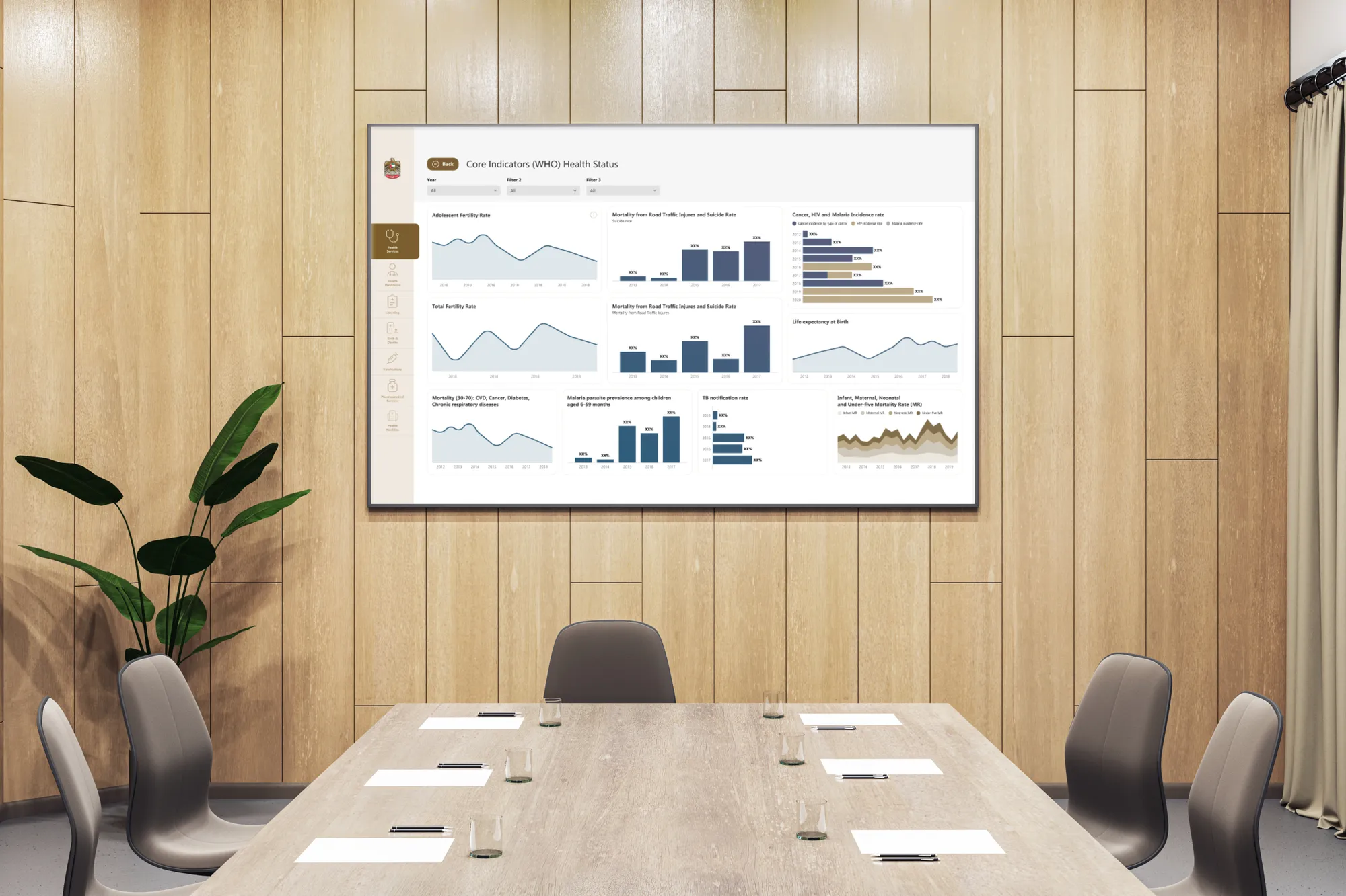
Healthcare indicators organized for faster understanding
The dashboard combines line charts, bar charts, comparison views, and segmented data cards to make public health indicators easier to understand. The interface keeps charts clean and consistent so users can focus on the trends, not the decoration.
Design System
A small set of choices, applied with discipline.
Outcome
A healthcare dashboard that makes key indicators easier to read, compare, and act on — giving decision-makers faster access to the insights that matter.
Next project
Want similar
results?
Share your challenge. We'll send back a quote, timeline, and plan.