Louis Vuitton — editorial deck for the maison
A presentation system designed to carry the codes of a maison into rooms where decisions get made.
Deck Overview
Louis Vuitton needed a presentation system that would travel with the same authority as the maison itself — capable of carrying campaign narratives, regional reviews, and partnership pitches without losing the editorial quality of the brand.
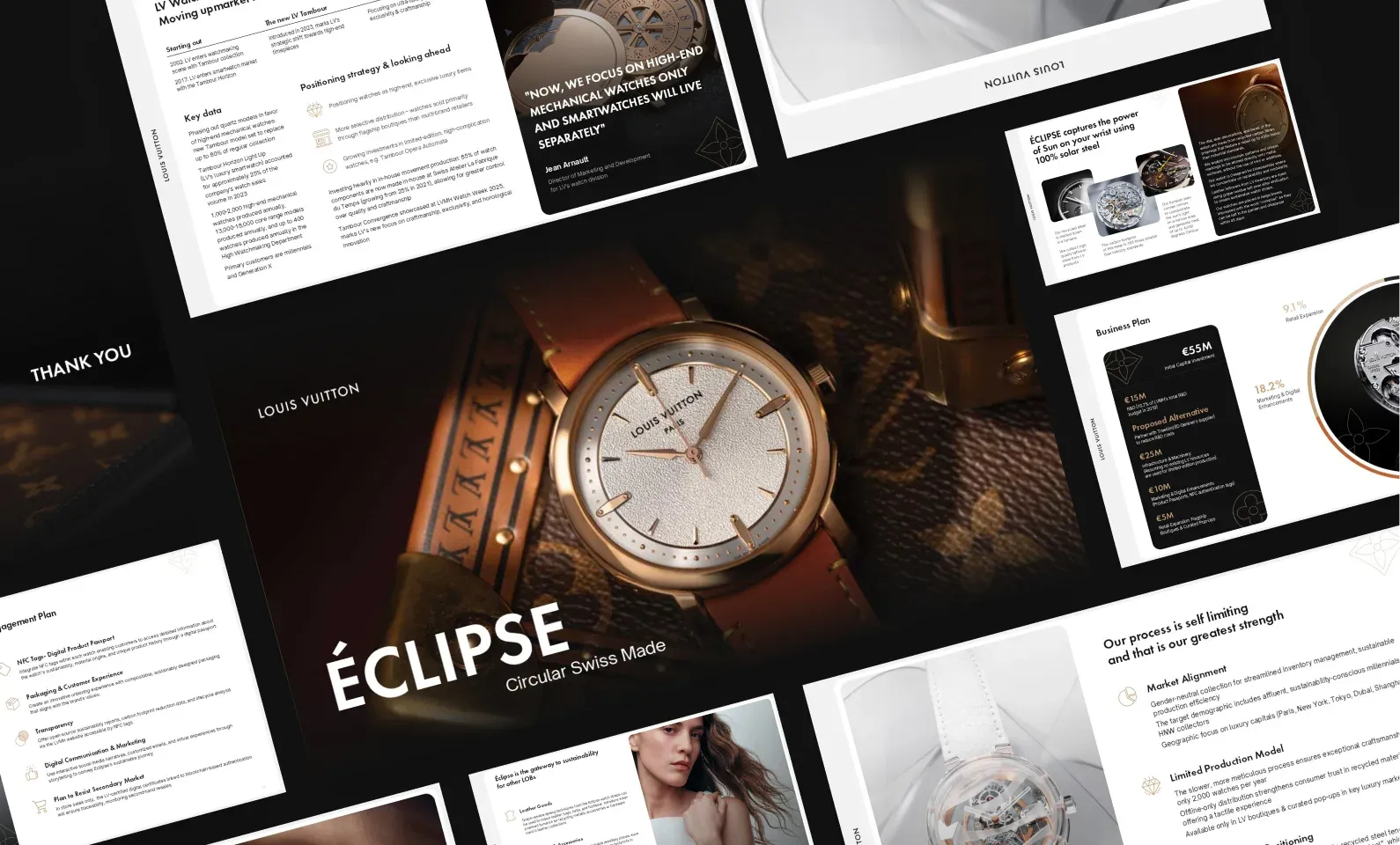
We built a modular deck system grounded in monogram, typography, and full-bleed image storytelling. Every layout is paced like a print editorial: generous margins, strong type, and imagery that earns the page.
Process
From concept to crafted detail.
A look at how the work came together — from early direction to the finished surfaces that ship.
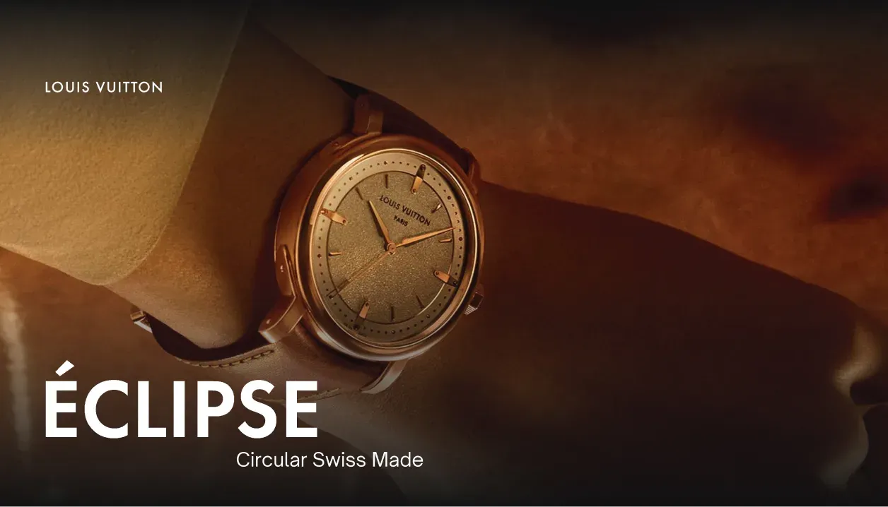
A monogram-led narrative system
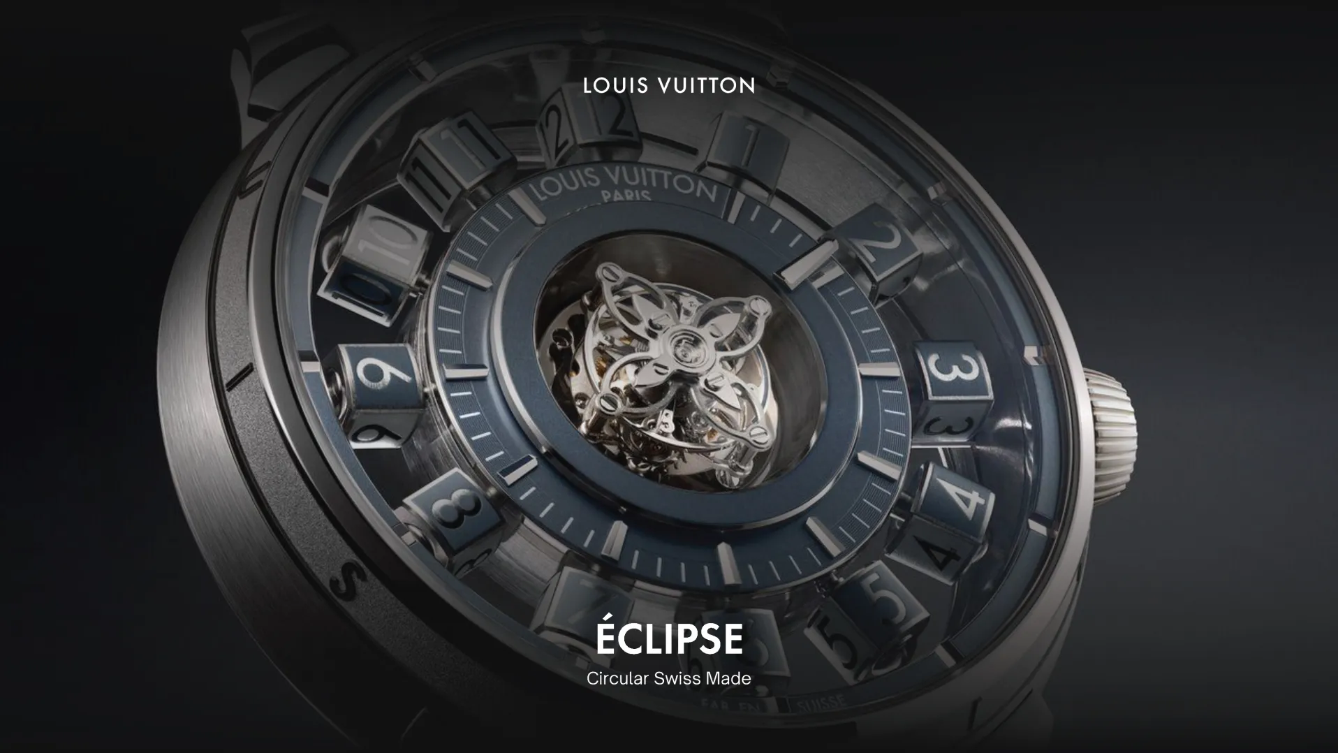
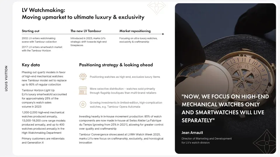
The deck opens like a lookbook. Each chapter is set by a full-bleed cover that frames the section, then resolves into structured content slides that carry numbers, quotes, and product detail without breaking the editorial cadence.
Editorial pacing, slide after slide
Typography is the spine. A single display face for chapter openers, a quiet serif for body and captions — paced with the discipline of a printed magazine across 60+ slides.
Design System
A small set of choices, applied with discipline.
Outcome
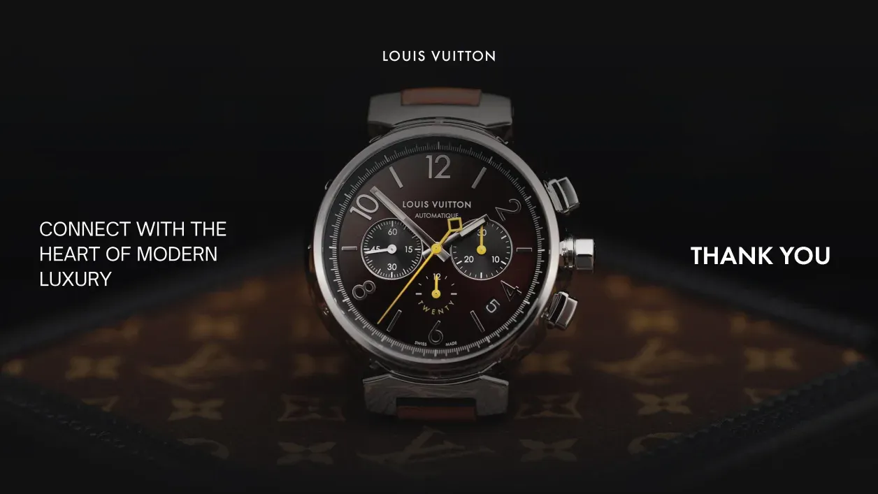
A deck system that holds its own in every room it enters — from regional reviews to partnership pitches at the executive level.
Next project
Want similar
results?
Share your challenge. We'll send back a quote, timeline, and plan.